

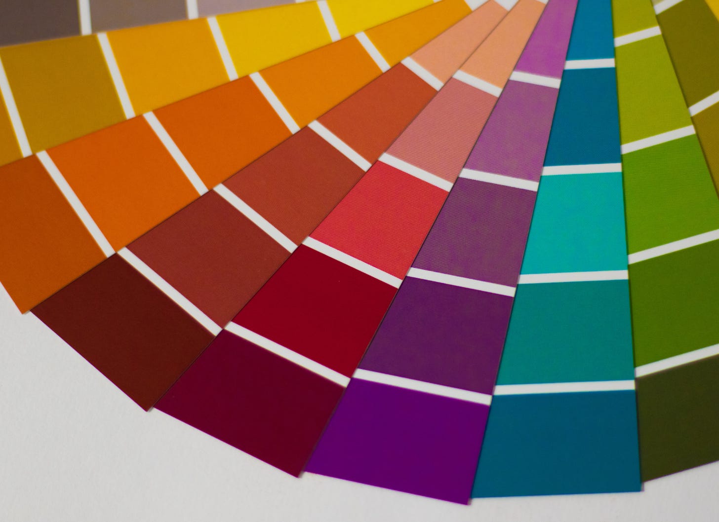
What does it mean when you start color-drenching with these colors?
Plus: COMING SOON! Sunday creativity prompts.

This is the newsletter of design journalist editor Emily Grosvenor, author of Find Yourself At Home.

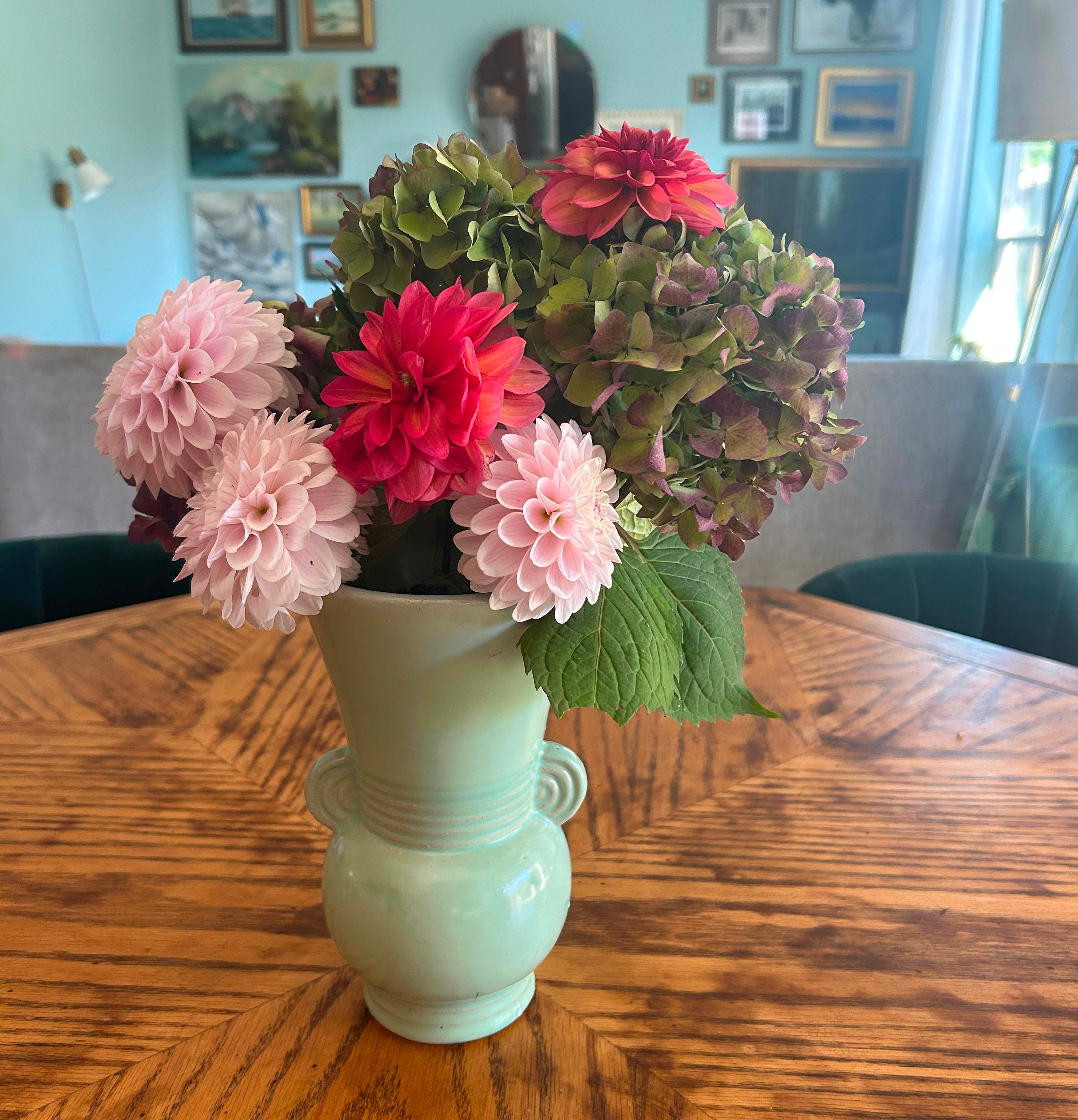
Help — I can’t stop it with green! For months now I keep buying green items, throwing green scarves around my shoulders, drinking out of green water bottles.
We got our house painted two shades of green with a creamy white trim last May. It took us until September to realize that we now have a car and a house and a water bottle that are the same color green.
Basically, we are color drenching over here — bringing one color prominently into our spaces.
Offering a powerful one-hue punch, color drenching reduces visual noise and can even make small spaces appear bigger. - Marius Thiese, Architectural Digest
When it comes to green, we are all in. We are silly for sage, we are greedy for grass, fans of fern, jumping at juniper.
And yet, this period has been associated with some feelings of burnout for some of us in the household.
All of this has got me thinking about what comes with color drenching, which is when someone makes a conscious choice to have a single color dominate a room or a space.
Single colors can be powerful and prophetic. Designers sometimes use this approach when they want to imbue a room with a specific energy that can only come with color.
But if you’re looking at it from a feng shui perspective, color drenching indicates imbalance. When you color drench, you are leaning into one energy to the exclusion of all others, which can lead, over time, to unwished-for dominance of a specific element.
An element?
Yes.
Each of the colors is associated with a specific element in the Chinese 5 Element Theory, which allots universal forces into the five elements of Metal, Water, Wood, Fire, and Earth.
It’s a theory used in Chinese Medicine that also applies to Feng Shui. In basic terms, the colors are connected to the elements, and the elements are associated with specific forces.
In other words, by bringing a lot of green to our home, we are inviting a lot of wood energy to the house.
Here’s what it might mean if you’re color drenching your life
Too much White or Gray = Rise and Grind Tech Bro energy
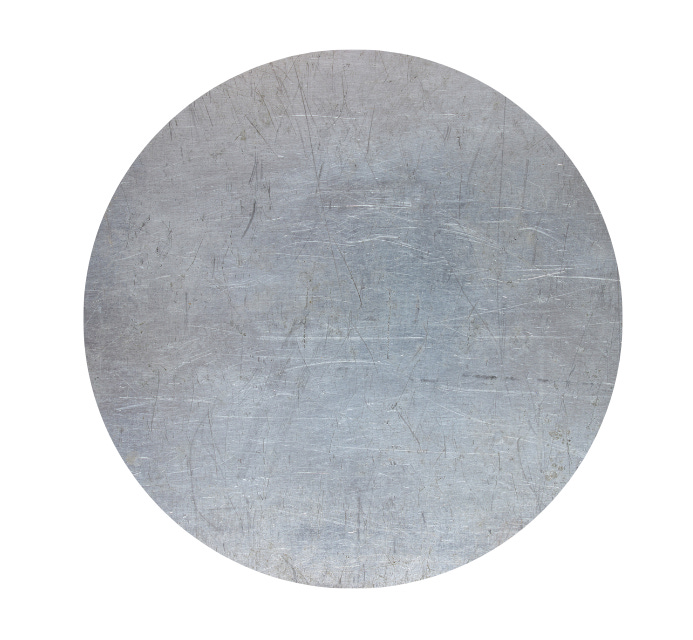
+ Metal energy is intellectual, creative, clear, and precise, a blank page signifying fresh starts. If you are adding a lot of white in your life, you might be seeking more organization, structure, and discipline.
- Too much white or gray might mean you are stuck in your head, rigid and overly critical. White and gray have “rise and grind” energy — think of what a tech bro’s office might look like. It can create coldness, isolation, and is sometimes associated with being stuck in a long-term grief cycle.
Balance it with : Water colors like lack or navy.
Too much Black (water) = Winona Ryder in her Shoplifting Era energy

+ Water energy is about wisdom and knowledge, abundance and adaptability.
- Too much black can lead to emotional overload (no surprise there — just think of cultures who grieve while wearing black). It can feel like stagnation, overwhelm, a lack of structure, or even depression. Sometimes, it is associated with overspending, or of too muchness. If it were a person it would be Winona Ryder during her shoplifting era.
Balance it with: Wood colors like green and/or blue or earth colors such as yellow, pink, or brown.
Too much Green / Blue (wood) = Tony Montana from Scarface energy
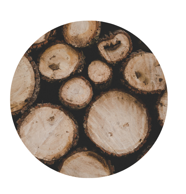
+ Wood energy is all about growth, new beginnings, ambition, vitality. It is associated with health, compassion, flexibility, and vitality.
- Too much of it can mean extreme burnout, impatience, resentment, and tension. If too much wood energy were a person it would be Tony Montana from Scarface — wanting more, wanting it now, or going after it, crashing out in the process. For your health, it can mean digestive issues or stiff muscles.
Balance it with: Metal colors like white and gray or fire colors like red and orange.
Too much Red / Orange (fire) = Gollum from LOTR energy
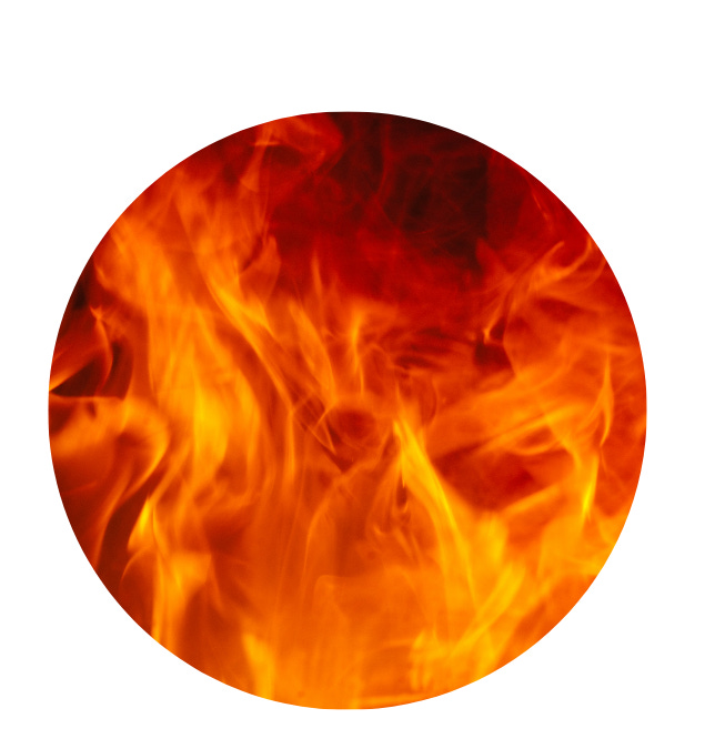
+ Fire is, as the kids would say, FIRE. It is associated with passion, energy, fame, light. It is the most powerful of the five elements (see how powerful red is!) and can help with expansion in all of its forms.
- If you remember Gollum from LOTR then you get too much fire energy — self-destructive and angry, can’t let things go, destroying oneself in the process of going after what he wants. Health-wise, it can mean insomnia, headaches, and overall inflammation.
Balance it with: Earth colors like brown, pink, or yellow
Too much Brown / Pink / Yellow (earth) = Barbie takes up ceramics energy
+ If you have a person you think of as "earthy,” then you recognize that they are grounded, stabile, nurturing, and harmonious. It tends to be associated with good health.
- There can be too much of Earth, however, like if Barbie got completely overwhelmed and took up a ceramics class to try to work everything out. In a personal space it can be stagnant and stuck, or have an excessive interest in earthly possessions. Is this what led to the humor site Werner Herzog’s Sad, Beige World?
Balance it with: Metal colors like white and gray
Any questions about how this works? You don’t have to have the full grasp of 5 Element Theory to use it in your home. Ask me in the comments.


I’ve got something special coming for you this Sunday.
Fundamentally, I have never liked Substacks that come on Sunday, since I prefer to do a digital detox that day and 100% do not want to be scrolling. I’ve felt this way ever since reading Sabbath by Abraham Joshua Heschel — it’s a book from the mid-20th Century about the deep cultural meaning of taking a day of rest. It hasn’t mattered to me that Sunday newsletters get more engagement than other days. I just refuse to insert myself into someone’s Sunday.
But now I am developing something that probably won’t fit on other days. I’m starting this Sunday with a creativity prompt inspired by one of my new favorite artists, Dan Gluibizzi, whose worked appeared in a project by Tandem Design on the very last print issue of Oregon Home that I edited (more on that below).
So stay tuned! You’ll hear from me in a few days, and do let me know if you like it.

Our backyard is insane right now! Real Harry & David vibes plus figs and dahlias and our 88 bonsai are green and happy. Soon, it will all be a Rilke poem, so I’m savoring.

This NYTimes story about inter-generational living seems well-timed (and is lovely).
I like this Good Housekeeping piece on Halloween decor trends, not least because it has a bunch of stuff I’ve predicted in this newsletter within the last year — hand-painted candles and busts.
Sat with this piece by Dana Goodyear for the New Yorker on what it is like to lose your house in a fire (it also contains deep reporting on what went wrong in Los Angeles).

📰 Are you still editing Oregon Home?
I am not. We got notice this week that the magazine in its current form is shutting down and I will no longer be working with Mediamerica. I’m feeling okay about it! Honestly it was a good run, and I’ll take my passion for home stories elsewhere. Like here? Anyway, if you are here because you are a designer or someone working in the home industry, feel free to keep pitching me stories at emilygrosvenor [at] gmail.com And if you are feeling like helping me through a financial contribution or buying me a virtual coffee, or by subscribing, do that here. ↓
🤔What are you doing differently?
Coffee weaning update. I’m not there yet. But I did switch up my favorite mug from this yellow stunner by Bend ceramic artist Peter Mayer to this Thumbelina octopus mug. Progress!
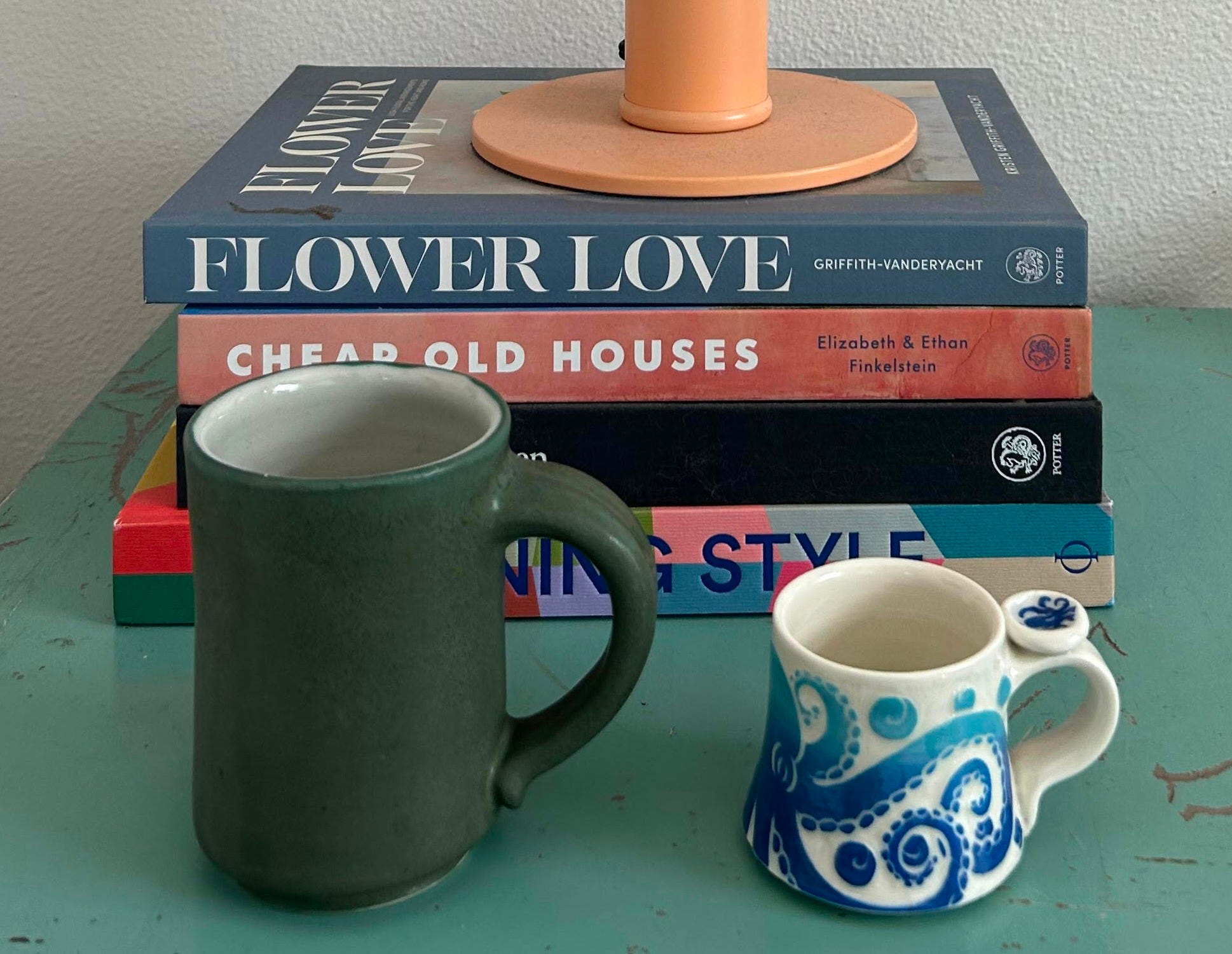
love the 5 elements re color ! i totally color drench when it comes to my wardrobe. i went thru a phase where everything i bought was olive and now black, white or tan. i just can't wear "color." speaking of ... i must be color blind because that coffee mug looks like a forest green to me and def not yellow ???